


Have read my previous blog??🧐🤔
The confusion matrix is rightly named so – it is really damn confusing !!🤯 It’s not only the beginners but sometimes even the regular ML or Data Science practitioners scratch their heads a bit when trying to calculate machine learning performance metrics with a “confusion matrix”.
To begin with, the confusion matrix is a method to interpret the results of the classification model in a better way. It further helps you to calculate some useful metrics that tells you about the performance of your machine learning model.
Come, let us take the confusion out of the confusion matrix.🤓
Let us take a very simple 2x2 example of a confusion matrix. Notice that along one axis we have the actual outcome and along the other we have the predicted outcome.
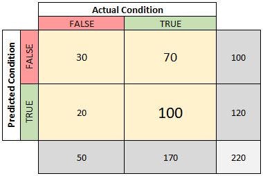
In each cell we have the count of observations that match the axes criteria.
The count of observations that were predicted as false and actually are false was 30.
The count of observations that were predicted as true and actually are false was 20.
Before that...
A QUICK NOTE:📝
1.The table can have different dimension sizes (e.g., 3x3, etc.). 2.The 'Actual' and 'Predicted' conditions may be flipped depending on the publisher.
METRICS
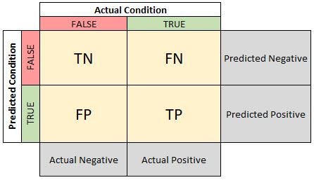
Now that we know what comprises the confusion matrix, we can begin to look closer at how the values provided can be evaluated to determine the effectiveness of our model. For the following analyses, we will use the more general confusion matrix where the counts have been replaced with “TP” for True Positives, “TN” for True Negatives, etc.
Before moving ahead, let's consider a scenario
True Positive:
Interpretation: You predicted positive and it’s true. You predicted that a woman is pregnant and she actually is.
True Negative:
Interpretation: You predicted negative and it’s true. You predicted that a man is not pregnant and he actually is not.
False Positive: (Type 1 Error)
Interpretation: You predicted positive and it’s false. You predicted that a man is pregnant but he actually is not.
False Negative: (Type 2 Error)
Interpretation: You predicted negative and it’s false. You predicted that a woman is not pregnant but she actually is.
Just Remember, We describe predicted values as Positive and Negative and actual values as True and False.
1. PREVALENCE
One of the fundamental meter of the confusion matrix, if not already known, is the prevalence. This value indicates how many true or positive cases are out of all of the observations. To calculate this value, divide all of the (actual) true observations with the total number of observations.

2. ACCURACY & MISCLASSIFICATION RATE
After understanding the prevalence, the next basic metric that can be derived is the prediction accuracy. Instead of dividing the count of actual true values, we divide the count of correct predictions by the total number of observations.

Alternatively, you can find the misclassification rate which indicates how often your model was wrong. Instead of looking at the correct predictions, we divide the count of incorrect predictions by the total number of observations.

You may have noticed that summing accuracy and misclassification rate will equal 1 or alternatively:

3. TRUE POSITIVE RATE (RECALL, SENSITIVITY) & FALSE NEGATIVE RATE
The true positive rate (also known as recall or sensitivity) is an important metric as it indicates all of the actual positive cases. To calculate, divide the number of true positives by the number of actual positive case

We can evaluate the false negative rate where we want to know how frequently we incur false negatives (predicted negative but actually positive).

The true positive rate added with the false negative rate equals 1.

4. FALSE POSITIVE RATE (MISS RATE) & TRUE NEGATIVE RATE (SPECIFICITY)
The false positive rate is also known as the miss rate. In other words, the false positive rate indicates how often we predict an actual negative observation to be true.

We can also evaluate the associated metric called the true negative rate which indicates how often we correctly classify negative cases.

You may have identified a pattern here: false positive rate plus specificity (TNR) equals 1.

5. POSITIVE PREDICTIVE VALUE (PRECISION) & FALSE DISCOVERY RATE
The positive predictive value (also known as precision) of our model will indicate how often we correctly classify an observation as positive when we predict positive. To calculate PPV we divide the number of correct positive guesses by the total number of positive guesses.

Alternatively, we can calculate the false discovery rate which indicates when we predict positive, how often are we incorrect.

And yes, adding false discovery rate and precision will sum to 1.

6. NEGATIVE PREDICTIVE VALUE & FALSE OMISSION RATE
The negative predictive value indicates how often we are correct (true) when we predict an observation to be negative.

If we want to know how often we are incorrect when we predict a value to be negative, we can evaluate the false omission rate.

Adding the negative predictive value with the false omission rate will sum to

PLOTTING THESE VALUES TO AID DECISION MAKING📈
Now that you understand the common metrics derived from the confusion matrix, we should explore two popular graphs that can be generated from the metrics (there are others but we will stick with these two for now).
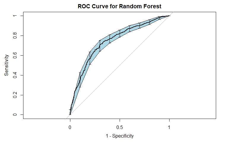
RECEIVER OPERATING CHARACTERISTIC (ROC) CURVE
An ROC Curve plots True Positive Rate (Sensitivity) against False Positive Rate (1 minus Specificity). This curve is instrumental when deciding what classification cutoff may be appropriate to use as tradeoffs in sensitivity and specificity can be seen. A term commonly used when evaluating an ROC Curve is the area under the curve (AUC). A perfect classifier has an AUC equal to 1 while a classifier which relies on a coin-flip has an AUC equal to 0.5.
An example from my post on predicting criminal recidivism is shown below:
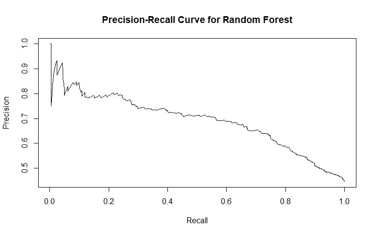
PRECISION-RECALL CURVE📉
A Precision-Recall Curve is a supplemental graph which can help identify appropriate cutoffs as well. Recall (Sensitivity, TPR) is plotted along the X-axis and precision (PPV) is plotted along the Y-axis. One note about precision-recall curves is that they do not account for true negatives. In other words, a model is not rewarded visually by a precision-recall curve for correctly identifying negative cases. Generally a curve with higher precision (Y-axis) is preferred although lines can cross-over multiple times.
An example from my post on predicting criminal recidivism is shown below:
Understanding these metrics takes time and practice. The names sound similar but the interpretations have stark contrasts with each other. So, keep practicing and very soon you will be perfect.